What is a Correlation Matrix and Why Do You Need It?
In the realm of data analysis, a correlation matrix is a powerful tool that helps uncover hidden patterns and relationships between variables. By creating a correlation matrix in Excel, analysts can identify correlations, trends, and patterns that may not be immediately apparent, ultimately informing business decisions and driving growth.
A correlation matrix is a table that displays the correlation coefficients between different variables in a dataset. It provides a snapshot of the strength and direction of the relationships between variables, allowing analysts to identify potential predictors, uncover hidden relationships, and gain insights into how changes in one variable affect others.
Learning how to make a correlation matrix in Excel is an essential skill for anyone working with data. By mastering this technique, analysts can unlock the full potential of their data, identify new opportunities, and drive business success. Whether you’re a business analyst, marketer, or researcher, a correlation matrix is an indispensable tool that can help you achieve your goals.
Preparing Your Data for Correlation Analysis
Before diving into the world of correlation matrices, it’s essential to prepare your data for analysis. This critical step ensures that your data is accurate, complete, and organized, ultimately affecting the reliability of your correlation matrix.
Data preparation involves several key steps, including data cleaning, formatting, and organization. Cleaning your data involves identifying and correcting errors, handling missing values, and removing duplicates. Formatting your data involves structuring it in a way that’s conducive to correlation analysis, such as converting categorical variables into numerical variables. Organizing your data involves arranging it in a logical and consistent manner, making it easier to analyze and interpret.
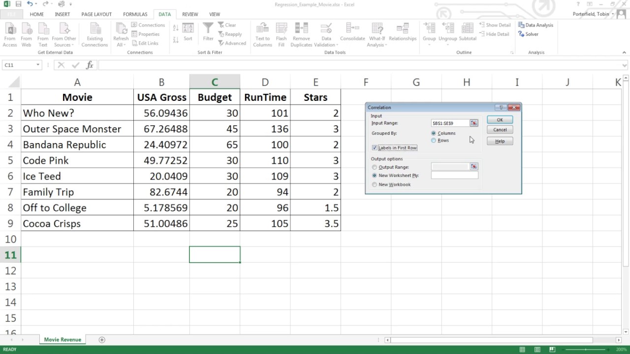
When preparing your data for correlation analysis in Excel, it’s crucial to ensure that your data is in a table format, with each column representing a variable and each row representing an observation. This format allows you to easily calculate correlation coefficients and create a correlation matrix. By taking the time to properly prepare your data, you’ll be able to create a correlation matrix that accurately reflects the relationships between your variables, ultimately driving informed business decisions.
By learning how to make a correlation matrix in Excel, you’ll be able to unlock the full potential of your data and gain valuable insights into the relationships between your variables. In the next section, we’ll explore how to calculate correlation coefficients in Excel using formulas, including the CORREL and PEARSON functions.
How to Calculate Correlation Coefficients in Excel
Calculating correlation coefficients is a crucial step in creating a correlation matrix in Excel. Correlation coefficients measure the strength and direction of the linear relationship between two variables. In Excel, there are two primary functions for calculating correlation coefficients: CORREL and PEARSON.
The CORREL function calculates the correlation coefficient between two arrays of numbers. The syntax for the CORREL function is `CORREL(array1, array2)`, where `array1` and `array2` are the two ranges of cells containing the data. For example, if you want to calculate the correlation coefficient between the values in columns A and B, you would use the formula `=CORREL(A:A, B:B)`.
The PEARSON function is similar to the CORREL function, but it’s more flexible and can handle more complex calculations. The syntax for the PEARSON function is `PEARSON(array1, array2)`, where `array1` and `array2` are the two ranges of cells containing the data. The PEARSON function is particularly useful when working with large datasets or when you need to calculate correlation coefficients for multiple pairs of variables.
When using either the CORREL or PEARSON function, it’s essential to ensure that your data is properly formatted and organized. This includes checking for missing values, outliers, and data entry errors, as these can significantly impact the accuracy of your correlation coefficients. By learning how to make a correlation matrix in Excel, you’ll be able to calculate correlation coefficients with ease and gain valuable insights into the relationships between your variables.
In the next section, we’ll explore how to create a correlation matrix in Excel using the CORREL function, including how to format and customize the output.
Visualizing Correlations: Creating a Correlation Matrix in Excel
Now that you’ve calculated the correlation coefficients, it’s time to create a correlation matrix in Excel. A correlation matrix is a table that displays the correlation coefficients between multiple variables, providing a visual representation of the relationships between your data.
To create a correlation matrix in Excel, follow these steps:
1. Select the range of cells that contains your data, including the headers.
2. Go to the “Formulas” tab in the ribbon and click on “More Functions” and then “Statistical” and finally “CORREL”.
3. In the “CORREL” function, select the entire range of cells as the first array, and then select the same range of cells as the second array. This will calculate the correlation coefficients for all possible pairs of variables.
4. Click “OK” to generate the correlation matrix.
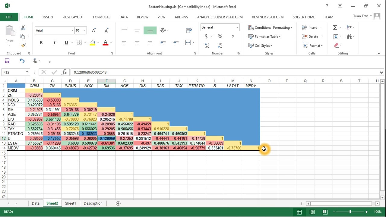
The resulting correlation matrix will display the correlation coefficients between each pair of variables, with the coefficients ranging from -1 (perfect negative correlation) to 1 (perfect positive correlation).
To customize the output, you can format the correlation matrix to make it easier to read and interpret. This can include adding headers, changing the font and color scheme, and using conditional formatting to highlight strong correlations.
By learning how to make a correlation matrix in Excel, you’ll be able to visualize the relationships between your variables and identify patterns and trends that may not be immediately apparent. In the next section, we’ll explore how to interpret correlation coefficients and identify strong and weak relationships.
Interpreting Correlation Coefficients: What Do the Numbers Mean?
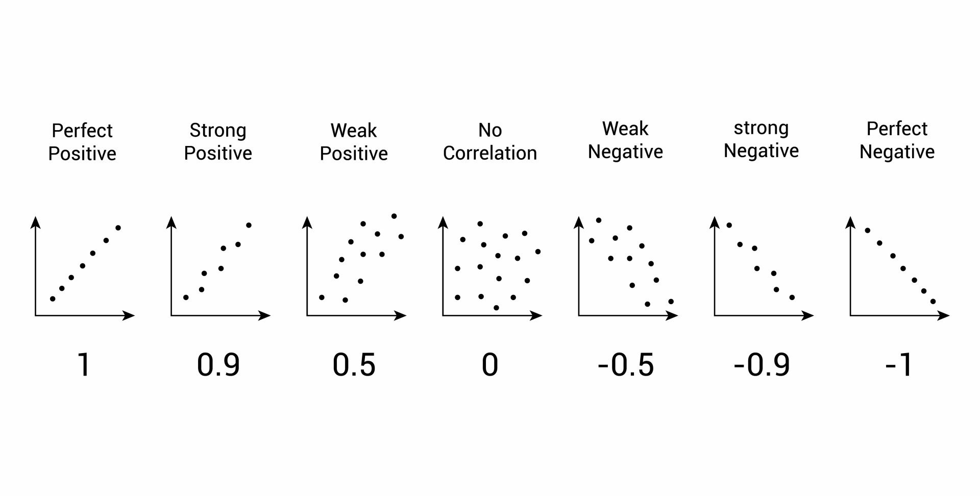
Now that you’ve created a correlation matrix in Excel, it’s essential to understand how to interpret the correlation coefficients. Correlation coefficients range from -1 to 1, and they indicate the strength and direction of the linear relationship between two variables.
A correlation coefficient of 1 indicates a perfect positive correlation, meaning that as one variable increases, the other variable also increases. A correlation coefficient of -1 indicates a perfect negative correlation, meaning that as one variable increases, the other variable decreases.
A correlation coefficient close to 0 indicates a weak or no correlation between the variables. In general, correlation coefficients between 0.5 and 0.8 indicate a moderate correlation, while coefficients above 0.8 indicate a strong correlation.
When interpreting correlation coefficients, it’s also important to consider the direction of the correlation. A positive correlation indicates that the variables move in the same direction, while a negative correlation indicates that the variables move in opposite directions.
For example, if you’re analyzing the relationship between stock prices and inflation rates, a positive correlation coefficient would indicate that as inflation rates increase, stock prices also tend to increase. On the other hand, a negative correlation coefficient would indicate that as inflation rates increase, stock prices tend to decrease.
By understanding how to interpret correlation coefficients, you can gain valuable insights into the relationships between your variables and make informed decisions. Remember, correlation does not imply causation, so it’s essential to consider other factors that may be influencing the relationships between your variables.
In the next section, we’ll discuss common pitfalls to avoid when creating a correlation matrix, including issues with data quality, sample size, and incorrect interpretation of results.
Common Pitfalls to Avoid When Creating a Correlation Matrix
When creating a correlation matrix in Excel, it’s essential to avoid common mistakes that can lead to inaccurate or misleading results. Here are some common pitfalls to watch out for:
Data Quality Issues: One of the most critical mistakes is using low-quality data, which can lead to incorrect correlation coefficients. Ensure that your data is clean, complete, and free from errors.
Sample Size: A small sample size can lead to unreliable correlation coefficients. Ensure that your sample size is sufficient to produce reliable results.
Incorrect Interpretation of Results: Correlation coefficients can be misinterpreted, leading to incorrect conclusions. Ensure that you understand the significance of positive and negative correlations, as well as strong and weak relationships.
Ignoring Non-Linear Relationships: Correlation matrices only identify linear relationships between variables. Ignoring non-linear relationships can lead to incomplete or inaccurate analysis.
Failing to Account for Multicollinearity: Multicollinearity occurs when two or more variables are highly correlated with each other. Failing to account for multicollinearity can lead to inaccurate correlation coefficients.
Not Considering Outliers: Outliers can significantly impact correlation coefficients. Ensure that you identify and address outliers in your data to produce reliable results.
By being aware of these common pitfalls, you can ensure that your correlation matrix is accurate and reliable, providing valuable insights into the relationships between your variables. In the next section, we’ll explore advanced correlation analysis using Excel’s Data Analysis ToolPak.
Advanced Correlation Analysis: Using Excel’s Data Analysis ToolPak
While creating a correlation matrix in Excel is a powerful tool for identifying relationships between variables, Excel’s Data Analysis ToolPak offers even more advanced correlation analysis capabilities. In this section, we’ll explore how to use the Data Analysis ToolPak to perform multiple regression and partial correlation analysis.
To access the Data Analysis ToolPak, go to the “Data” tab in Excel and click on “Data Analysis” in the “Analysis” group. Then, select “Regression” from the list of available tools.
Multiple Regression Analysis: Multiple regression analysis allows you to examine the relationship between multiple independent variables and a single dependent variable. To perform multiple regression analysis, select the range of data that includes the independent variables and the dependent variable, and then click “OK” to run the analysis.
Partial Correlation Analysis: Partial correlation analysis allows you to examine the relationship between two variables while controlling for the effects of one or more additional variables. To perform partial correlation analysis, select the range of data that includes the two variables of interest and the controlling variables, and then click “OK” to run the analysis.
The Data Analysis ToolPak provides a range of output options, including coefficients, standard errors, and p-values, which can be used to interpret the results of the analysis. By using the Data Analysis ToolPak, you can gain a deeper understanding of the relationships between your variables and make more informed decisions.
For example, in finance, multiple regression analysis can be used to examine the relationship between stock prices and various economic indicators, such as GDP and inflation rate. Partial correlation analysis can be used to examine the relationship between two economic indicators while controlling for the effects of other indicators.
By mastering the Data Analysis ToolPak, you can take your correlation analysis to the next level and uncover even more insights from your data. In the next section, we’ll explore real-world applications of correlation matrices in Excel.
Real-World Applications of Correlation Matrices in Excel
Correlation matrices are a powerful tool in data analysis, and their applications are diverse and widespread. In this section, we’ll explore how correlation matrices are used in real-world scenarios, including finance, marketing, and healthcare, to demonstrate the practical value of this analytical tool.
In finance, correlation matrices are used to analyze the relationships between different asset classes, such as stocks, bonds, and commodities. By identifying strong correlations between assets, investors can create diversified portfolios that minimize risk and maximize returns. For example, a correlation matrix can help identify the relationship between the S&P 500 index and the price of gold, allowing investors to make informed decisions about their investments.
In marketing, correlation matrices are used to analyze customer behavior and preferences. By identifying correlations between different customer demographics and purchasing habits, businesses can create targeted marketing campaigns that resonate with their target audience. For example, a correlation matrix can help identify the relationship between age and purchasing habits, allowing businesses to tailor their marketing efforts to specific age groups.
In healthcare, correlation matrices are used to analyze the relationships between different health metrics, such as blood pressure, heart rate, and body mass index. By identifying correlations between these metrics, healthcare professionals can identify high-risk patients and develop targeted interventions to improve health outcomes. For example, a correlation matrix can help identify the relationship between blood pressure and heart rate, allowing healthcare professionals to develop personalized treatment plans for patients with hypertension.
These examples demonstrate the practical value of correlation matrices in real-world scenarios. By learning how to make a correlation matrix in Excel, you can unlock the power of data analysis and make informed decisions in your field. Whether you’re an investor, marketer, or healthcare professional, correlation matrices can help you identify hidden patterns and relationships in your data, leading to better outcomes and more informed decision-making.


