What is Kurtosis and Why Does it Matter in Data Analysis?
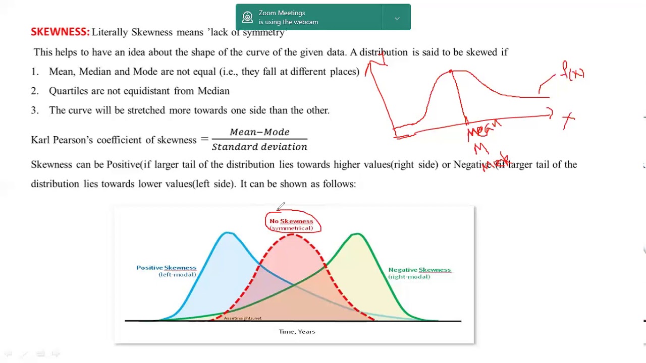
In data analysis, understanding the distribution of data is crucial for making informed business decisions. One often overlooked yet vital aspect of data distribution is kurtosis. Kurtosis measures the tailedness of a distribution, providing insights into the likelihood of extreme values. In essence, kurtosis helps identify outliers, understand data distribution, and make informed business decisions. To effectively analyze data, it’s essential to comprehend the concept of kurtosis and its significance in data analysis. Unlike skewness, which measures the asymmetry of a distribution, kurtosis focuses on the thickness of the tails. A high kurtosis indicates a distribution with fat tails, whereas a low kurtosis suggests a distribution with thin tails. By grasping the concept of kurtosis, data analysts can better understand their data, identify potential risks, and make data-driven decisions. In the following sections, we will explore how to find kurtosis in Excel, preparing data for kurtosis calculation, and interpreting kurtosis values.
Preparing Your Data for Kurtosis Calculation
Before diving into the calculation of kurtosis in Excel, it’s essential to prepare your data to ensure accurate results. Data preparation is a critical step in any data analysis, and kurtosis calculation is no exception. To get started, follow these best practices to prepare your data for kurtosis calculation:
Data cleaning is a crucial step in preparing your data for kurtosis calculation. Remove any unnecessary columns or rows, and handle missing values by either removing them or replacing them with a suitable value. Additionally, ensure that your data is in a numerical format, as kurtosis calculation requires numerical data.
Selecting the right data range is also vital in kurtosis calculation. Ensure that you select the entire dataset, including the headers, to get an accurate calculation of kurtosis. If your dataset is large, consider breaking it down into smaller subsets to make the calculation more manageable.
By following these data preparation steps, you’ll be well on your way to accurately calculating kurtosis in Excel and gaining valuable insights into your data distribution. In the next section, we’ll explore how to find kurtosis in Excel using the KURT function.
Using Excel Formulas to Calculate Kurtosis
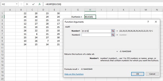
Now that your data is prepared, it’s time to calculate kurtosis in Excel. The KURT function is a built-in Excel formula that makes it easy to calculate kurtosis. The syntax for the KURT function is as follows: KURT(number1, [number2], …), where number1, number2, etc
Interpreting Kurtosis Values: What Do They Mean?
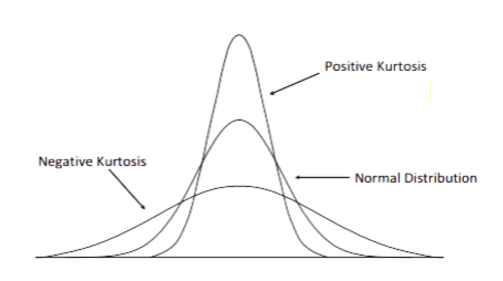
Now that you’ve calculated kurtosis in Excel using the KURT function, it’s essential to understand what the values mean. Kurtosis values can range from -3 to infinity, with a kurtosis of 0 indicating a mesokurtic distribution, which is similar to a normal distribution. A kurtosis value greater than 0 indicates a leptokurtic distribution, which is more peaked than a normal distribution, while a kurtosis value less than 0 indicates a platykurtic distribution, which is flatter than a normal distribution.
A high kurtosis value, typically above 1, indicates that the data has heavy tails or outliers, which can significantly impact data analysis and modeling. On the other hand, a low kurtosis value, typically below -1, indicates that the data has light tails or a lack of outliers. Understanding kurtosis values is crucial in identifying patterns and trends in data, which can inform business decisions, such as risk management and investment analysis.
For example, in finance, a high kurtosis value may indicate a higher risk of extreme losses or gains, while a low kurtosis value may indicate a more stable investment. By understanding kurtosis values, businesses can make informed decisions about investments, risk management, and portfolio optimization. In the next section, we’ll discuss common errors to avoid when calculating kurtosis in Excel and provide troubleshooting tips.
Common Errors to Avoid When Calculating Kurtosis in Excel
When calculating kurtosis in Excel, it’s essential to avoid common errors that can lead to inaccurate results. One of the most common mistakes is selecting the wrong data range. Make sure to select the entire dataset, including all the values, to get an accurate kurtosis calculation. Another mistake is ignoring missing values or outliers, which can significantly impact the kurtosis value.
Additionally, be cautious when using the KURT function in Excel, as it can be sensitive to the data format. Ensure that the data is in a numerical format, and not in text or date format, to avoid errors. It’s also important to check for any errors in the data, such as incorrect or duplicate values, which can affect the kurtosis calculation.
To troubleshoot common errors, start by checking the data range and format. Verify that the data is clean and free of errors, and that the KURT function is applied correctly. If you’re still experiencing issues, try breaking down the data into smaller subsets or using alternative methods to calculate kurtosis, such as the moment coefficient of kurtosis.
By being aware of these common errors and taking steps to avoid them, you can ensure accurate kurtosis calculations and make informed business decisions. In the next section, we’ll explore how to visualize kurtosis using informative charts and graphs.
Visualizing Kurtosis: How to Create Informative Charts and Graphs
Visualizing kurtosis can help to better understand the distribution of data and identify patterns and trends. In Excel, there are several types of charts and graphs that can be used to illustrate kurtosis, including histograms, box plots, and scatter plots.
Histograms are a popular choice for visualizing kurtosis, as they provide a clear representation of the data distribution. To create a histogram in Excel, select the data range, go to the “Insert” tab, and click on “Histogram”. This will create a chart that shows the frequency of each data point, allowing you to visualize the kurtosis of the data.
Box plots are another useful visualization tool for kurtosis. They provide a summary of the data distribution, including the median, quartiles, and outliers. To create a box plot in Excel, select the data range, go to the “Insert” tab, and click on “Box and Whisker”. This will create a chart that shows the distribution of the data, including any outliers or skewness.
Scatter plots can also be used to visualize kurtosis, particularly when analyzing the relationship between two variables. To create a scatter plot in Excel, select the data range, go to the “Insert” tab, and click on “Scatter”. This will create a chart that shows the relationship between the two variables, allowing you to identify any patterns or trends.
When interpreting these charts and graphs, look for signs of high or low kurtosis, such as heavy tails or outliers. This information can be used to inform business decisions, such as risk management and investment analysis. By visualizing kurtosis, you can gain a deeper understanding of your data and make more informed decisions.
In the next section, we’ll explore real-world applications of kurtosis in business and finance, including risk management, investment analysis, and portfolio optimization.
Real-World Applications of Kurtosis in Business and Finance
Kurtosis has numerous applications in business and finance, where understanding data distribution is crucial for making informed decisions. In risk management, kurtosis helps identify potential outliers and extreme events that can impact investment portfolios. By analyzing kurtosis, financial analysts can better assess risk and develop strategies to mitigate it.
In investment analysis, kurtosis is used to evaluate the performance of assets and portfolios. A high kurtosis may indicate a higher risk of extreme returns, while a low kurtosis may suggest a more stable investment. This information can be used to optimize portfolio allocation and maximize returns.
In portfolio optimization, kurtosis is used to identify the most efficient portfolio composition. By analyzing the kurtosis of different assets, investors can create a portfolio that balances risk and return. This approach can help investors achieve their financial goals while minimizing risk.
Additionally, kurtosis is used in credit risk assessment, where it helps identify borrowers who are more likely to default. By analyzing the kurtosis of credit scores, lenders can better assess credit risk and make more informed lending decisions.
In finance, kurtosis is also used to analyze market trends and identify potential bubbles. By analyzing the kurtosis of market returns, analysts can identify signs of instability and make more informed investment decisions.
These are just a few examples of how kurtosis is used in real-world business and finance applications. By understanding kurtosis and how to calculate it in Excel, professionals can gain a deeper understanding of their data and make more informed decisions.
Conclusion: Mastering Kurtosis in Excel for Data-Driven Decision Making
In conclusion, understanding how to find kurtosis in Excel is a crucial skill for data analysts and business professionals. By mastering kurtosis, you can uncover hidden patterns in your data, identify outliers, and make informed business decisions. Whether you’re working in finance, marketing, or operations, kurtosis can help you drive business growth, optimize processes, and stay ahead of the competition.
By following the steps outlined in this guide, you can confidently calculate kurtosis in Excel, interpret the results, and apply them to real-world business problems. Remember to prepare your data carefully, avoid common errors, and visualize your results to gain deeper insights.
As you continue to work with kurtosis, keep in mind its many applications in business and finance, from risk management to portfolio optimization. By leveraging kurtosis, you can develop a competitive edge, drive innovation, and achieve your business goals.
With this comprehensive guide, you’re now equipped to unlock the power of kurtosis in Excel and take your data analysis to the next level. Start exploring your data today and discover the insights that kurtosis can reveal.

:max_bytes(150000):strip_icc()/Clipboard01-8bd7469732784d998c4059c2fd898489.jpg)

:max_bytes(150000):strip_icc()/kurtosisformula-56a8faa25f9b58b7d0f6ea41.jpg)

